Solar’s Future is Insanely Cheap (2020)
This is part 1 of a series where I’ll look at the future costs of clean energy and mobility technologies. This is a refresh of and expansion of my 2015 series on the future of solar, wind, batteries, and electric vehicles. Tune back in for more.
I’ve spent the last decade writing about, speaking about, and investing in clean energy and mobility. Over that time, I’ve made a series of forecasts about the future costs of clean energy technologies, including solar, wind, energy storage, and electric vehicles.
My first forecast, in 2011, was of the future cost of solar. It was quite a naive model, with errors I wince at today. It was also, at the time, more optimistic about the pace of solar cost declines than any other forecast I’d seen. My 2015 update was more sophisticated, correcting some important methodological errors of the 2011 forecast. It was also more optimistic about price declines than any other model I’d seen.
Both of those forecasts were wrong. Solar has plunged in price faster than anyone – including me – predicted. And modeling of that price decline leads me to forecast that solar will continue to drop in price faster than I’ve previously expected, and will ultimately reach prices lower than virtually anyone expects. Prices that are, by any stretch of the measure, insanely, world-changingly cheap.
Ten Years of Plunging Solar Prices
Before going on to the future, let’s look at the last decade, and how exceptional it’s been. To do so, it’s tempting to look at the constant drumbeat of record-setting news-making solar auction prices, like bids at a costs of 1.35 cents per kwh in Abu Dhabi or 1.6 cents per kwh in Portugal.
I love talking about these record-setting prices; however, they are outliers. In addition, from the day a record-setting price is announced, it’s often two or more years until the project is actually built. These prices reflect the costs solar developers believe they can achieve at some point in the future, and buyers in that position treat them as directional budgets rather than guarantees.
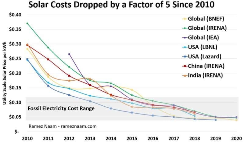
Instead, let’s look at metrics of average cost of projects actually built since 2010 and averages (not just outliers) of bids for projects scheduled to come online in 2020. All the costs below are unsubsidized, by the way, as are all costs used in this post.
The data in the chart above comes from multiple independent data sources and includes three global measures, two US measures, one from China, and one from India. (More details on these data series and links to sources are in appendix 1.) And while these data sets differ in places, together they paint an overwhelming consistent picture: The price of electricity from utility-scale solar projects (the unsubsidized cost) has dropped by a factor of somewhere between 5 and 8 in the years from 2010 to 2020.
In addition, if we look at the gray shaded area of the chart above, showing the cost of electricity from fossil fuels (primarily coal and natural gas) we can see that building new solar plants started to become competitive on raw cost in the middle of this past decade, and is increasingly looking cheaper than building new fossil power plants. (Though solar still suffers from intermittency, the economics of which we’ll come back to in a future post.)
Clearly, this has been a remarkable decade for solar power.
Outshining the Forecasts
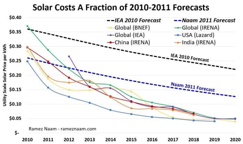
Just as remarkably, and relevant for considering the future cost of solar, the decline of solar prices over the past decade has been faster than almost any credible forecast. Let’s add forecasts made by the International Energy Agency (IEA) in their 2010 World Energy Outlook, along with the forecast I made in 2011 at Scientific American. When we do, using dashed lines for the forecasts, we see that actual solar prices are well below those expected by the world’s most well-known energy analyst and forecaster (the IEA), and even below the most optimistic projections put forward a decade ago (mine).
In fact, solar in 2020 is:
– Less than half the price I forecast in 2011.
– Less than a quarter of the price the IEA forecast in 2010.
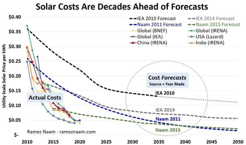
Another way to look at this is by asking: How many years ahead of expectations are these solar prices? And the answer there is even more revealing. Let’s zoom out, extending the timescale out to 2050, so we can see when previous forecasts expected solar prices to reach the levels they’re at today. In addition, we’ll add the IEA’s 2014 forecast from their Solar Technology Roadmap and my more recent 2015 solar cost forecast.
What we see is that solar has reached today’s prices literally decades ahead of when all but one of these forecasts expected. And even the most optimistic projection on this chart – my 2015 forecast – showed solar prices dropping at just about half the rate they’ve actually declined at over the past five years.
In fact, solar has reached prices today that are:
– 7 to 10 years ahead of what I forecast in 2015.
– 10 to 15 years ahead of what I forecast in 2011.
– 30 to 40 years ahead of what the IEA forecast in its 2014 Solar Technology Roadmap.
– 50 to 100 years ahead of what the IEA forecast in its 2010 World Energy Outlook. (Depending on how one extrapolates IEA’s forecasts from 2010. Indeed, it’s also possible to interpret the IEA’s 2010 forecasts as to say that solar electricity is now cheaper than the IEA thought it would ever be, back in 2010.)
In short solar prices have dropped faster and lower than almost anyone has expected. (I look at why these forecasts have been so wrong in appendix 2.)
Understanding Solar’s Price Decline
We can use the last decade to predict the future prices of solar power. Not by looking at the cost of solar as a function of time, but by looking at the cost of solar as a function of cumulative scale of the solar industry. By doing that, we can build a model that predicts future prices.
Technology Prices Drop Through Learning
To do this, we can use Wright’s Law, or the “learning curve”. Wright’s Law states that, for most technologies, every doubling of cumulative scale of production will lead to a fixed percentage decline in cost of the technology. This happens through learning-by-doing, a mixture of innovation that improves the technology itself and innovation that reduces the amount of labor, time, energy, and raw materials needed to produce the technology.
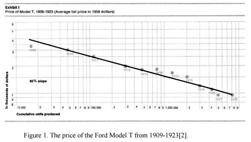
Wright first observed that every doubling of scale led to a constant percentage reduction in cost in 1936, while studying the production costs of airplanes. Since Wright’s initial observation, the same power law relationship between cumulative production and cost has been found in other areas. For example, every doubling of cumulative Ford Model T production led to a roughly 16% decline in cost per unit.
Wright’s Law is similar in some ways to Moore’s Law: an exponential decline in the cost of computing over time. Wright’s formulation is slightly different: an exponential decline in the cost of technologies as a function of cumulative scale of production. Remarkably, Wright’s Law predicts the cost of computing better than Moore’s Law.
And indeed, Wright’s Law has been found to apply at least 60 other technologies.
Solar Prices Drop Through Learning
Does Wright’s Law / the learning curve apply to the cost of solar? It’s well-established that it applies to the cost of solar modules. The price of solar modules per watt of power drops by somewhere around 25% for every doubling of cumulative manufacturing.
But solar modules are only around a third of the cost of solar electricity. The rest comes from related equipment (inverters, trackers, cabling, mounting systems), land, labor, and other non-module costs. What we need is to see if the cost of electricity from whole solar systems drops in such a way. In 2015, I used data from one source (Lawrence Berkeley Lab), in one country (the US) to show a very consistent learning rate for electricity produced from utility-scale solar.
To make this more robust, this time let’s use data from four different sources encompassing both global averages and costs in three countries (the US, India, and China).
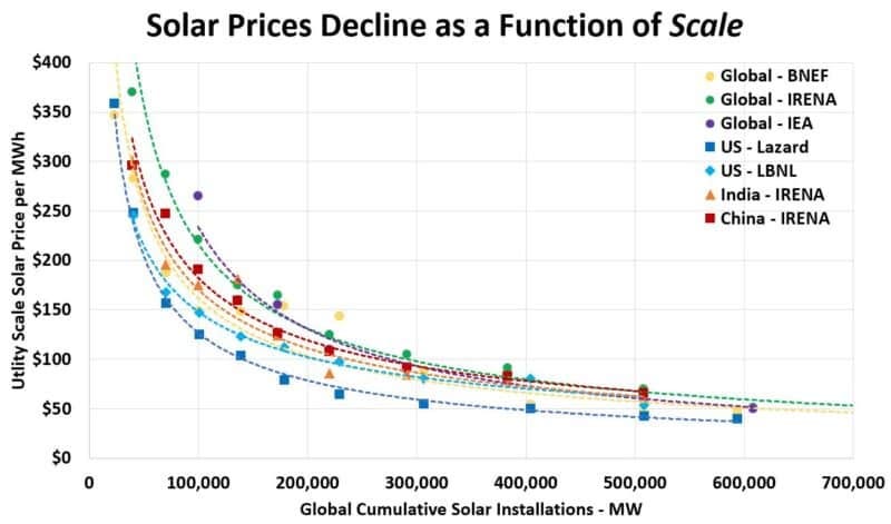
If we look at the price of solar from each of those seven data series declines as a function of how much solar power has been built and deployed we find a fairly smooth relationship.
But the chart above is on a linear scale, and thus it doesn’t tell us if a learning rate applies. Learning-by-doing in Wright’s Law works on an exponential scale. Every doubling of cumulative production leads to a percentage change in cost. That means that percentage drop in cost through learning requires twice as much cumulative scaling of industry as the last time.
Broadly speaking, if a numerical phenomenon is exponential, it shows up as a straight line on a log scale. It’s a straight line on an upward slope if it’s showing exponential growth, or a straight line on a downward slope if it’s showing an exponential decline in some metric (like cost).
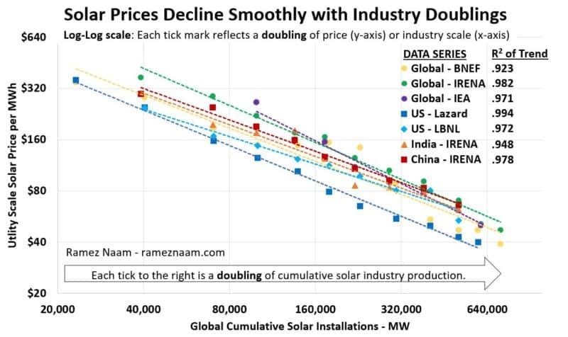
Because a learning rate is exponential in price in proportion to each doubling of scale, it will only show up as a straight line if if the x axis (scale) is also exponential. Thus, if solar is going through a learning rate (as expressed by Wright’s Law) we’d expect to see the cost of solar follow a straight line on a log-log scale (a doubling of prices with each tick on the Y axis, and a doubling of cumulative industry scale with each tick on the X axis.)
Indeed, that’s what we see. And not just in one data set or from one country. All seven data series spanning global, US, Chinese, and Indian trends show that the price of solar electricity (on a log scale) declines smoothly with each doubling of the total amount of solar deployed worldwide (a log axis of scale).
The numbers in the upper right, the “R squared” value, reflect just how good a fit the raw data are to this straight line on a log-log graph. The fit is measured on a scale of 0-1, with 0 meaning no fit at all, and 1 meaning a perfect fit where every value is exactly where you’d expect it. Of course, in the real world, observations never precisely fit data. Here, though, they fit extremely well: Each of our seven data series has an R-squared well over 0.9, with most of them at 0.95 or above. In short, solar prices map extremely well to Wright’s Law. They decline with a learning rate. Every time the cumulative amount of solar we’ve deployed around the world has doubled, the price of electricity from utility-scale solar plants has dropped by a fairly consistent percentage.
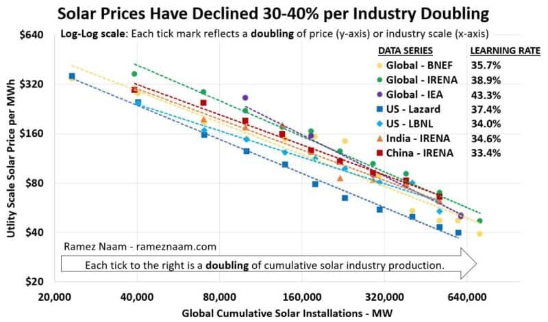
How large is that percentage decrease in solar cost per doubling? The data paint an incredible picture: One that shows the price of solar electricity from utility-scale systems dropping by anywhere from 30-40% with each doubling of cumulative solar deployment.
This is a stunning pace of decline. It’s far higher than the bulk of academic studies and industry projections, which typically fall into the 10-20% learning per doubling range. And it’s more than twice the 16% learning rate I found in my 2015 analysis. For analysis of why these results are so different, and what specifically I’ve fixed from my 2015 forecast, see appendix 2.
The Future Cost of Solar
For now, let’s use this data to forecast the future cost of solar. In so doing, I’m going to be conservative. Solar learning rates have varied somewhat over time, and while both the first half and second half of the period I’ve used in this analysis show very similar rates, there’s certainly the possibility that things could change in the future. There’s also a very real likelihood that auction prices (used in the IEA historic data set, and for 2015-2020 in the IRENA global data set) are dropping due to a combination of lower and lower borrowing costs for solar developers, and increased competitive pressure that’s eating into the profit margins of developers. Both of those numbers can only sustainably drop to zero.
In addition, if we look at a different data set showing capital costs of new solar in the US (the ‘overnight construction cost’, measured by Lawrence Berkeley National Lab) we find a learning rate much more like 30%. which is at the bottom of the learning rate for electricity cost. (The price of electricity from solar projects is dropping somewhat faster than the construction cost of solar projects.)
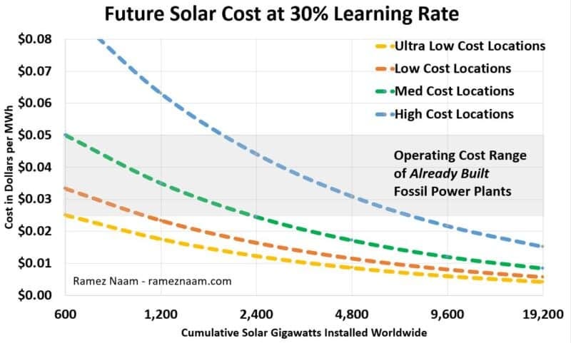
So, in the spirit of caution, let’s use 30% as our learning rate. This is still a very rapid pace of cost reduction. If we use it to plot solar prices forward as a function of cumulative solar scale, we get this:
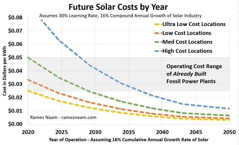
At the end of 2019, solar produced just over 2% of global electricity. The chart above tells us that after two more doublings, when 2,400 GW of solar are producing roughly 8% of current electricity demand, solar costs (of the most recently built built & operational projects) will have dropped in half from today’s levels. In the sunny parts of the world with low costs of capital, labor, and land, we could routinely be seeing unsubsidized solar in the 1-2 cent range. In California (typical of the green line) we could be seeing unsubsidized solar at 2.5 cents per kwh. In northern Europe, we could be seeing utility scale solar routinely priced at 4-5 US cents per kwh.
To the far right of the graph we reach 19 Terawatts of Solar. This may seem like an absurd, pathological amount of solar, enough to provide 2/3 of the world’s current electricity production. Given that the sun shines only during the day, this looks implausible. However, electricity demand is likely to rise over the coming decades, and demand for the cheapest electricity in particular, as:
1. A richer world. Incomes and consumption rise in the developing world.
2. Electric transport. Ground transportation becomes electrified, boosting global electricity demand by as much as 50%
3. Flexible demand. More and more electricity demand (including EV charging) becomes flexible, to use electricity at the hours that it’s cheapest (frequently meaning solar).
4. Cheap energy storage. Cheap energy storage allows shifting of solar (the cheapest electricity) to use in evening hours, increasing the amount of solar that can be productively used each day.
5. Industrial decarbonization. Cheap clean electricity is used to either power industrial processes or to power the creation of chemical energy carriers (e.g., hydrogen) that can be used for industrial processes such as making heat and cement, that are currently difficult to decarbonize.
Add these up, and it’s plausible that solar’s contribution to the energy system could double or triple the amount currently considered feasible for solar to provide.
When Will This Ultra-Cheap Solar Arrive?
Predicting the price of solar as a function of scale is one thing. Predicting how fast the world reaches that scale is an altogether harder problem, as that depends not just on technology or economics, but also on policy choices, the resistance of incumbent players, and ultimately, politics.
Nevertheless, we can try. The IEA’s Sustainable Development Scenario – broadly consistent with keeping global warming to 2 degrees Celsius or less – calls for solar power to grow at 16% annually. The IEA has also stated in their most recent World Energy Outlook that solar is indeed on path to achieve that. 16% annual growth rather slow compared to the nearly 40% CAGR of the solar industry from 1998 to 2018. But solar growth has very clearly slowed over the past few years. While I believe solar growth will accelerate again (super cheap solar should, in fact, cause an acceleration of deployment), let’s use the IEA’s 16% annual growth as our model.
At 16% annual growth, here are the prices we get:
This incredible pace of solar cost decline, with average prices in sunny parts of the world down to a penny or two by 2030 or 2035, is just remarkable. Building new solar would routinely be cheaper than operating already built fossil fuel plants, even in the world of ultra-cheap natural gas we live in now. This is what I’ve called the third phase of clean energy, where building new clean energy is cheaper than keeping fossil fuel plants running. Even in places like Northern Europe, by the later 2030s we’d see solar costs below the operating cost of fossil fuels, providing cheap electricity in summer months with their very long days in the high latitudes. These prices would be disruptive to a large fraction of already operating fossil fuel power plants – particularly coal power plants, that are far less able to ramp their power flexibly to follow solar’s day-night cycle.
In a purely open market, these incredibly low prices would drive the world’s remaining coal plants into bankruptcy, and steal some of the most profitable operating hours even from cheap natural gas plants.
Solar, if it keeps dropping at this pace, could well be by far the cheapest electricity over the vast majority of areas where people live. Nothing would ever be quite the same in the world of energy.
The IEA is Still Underestimating Solar Cost Trends
Now, let’s come back one last time to future forecasts from the world’s leading energy authority – the IEA. I’ve shown that IEA’s 2010 and 2014 expectations of the cost of solar were dramatically higher than the actual costs we’ve seen.
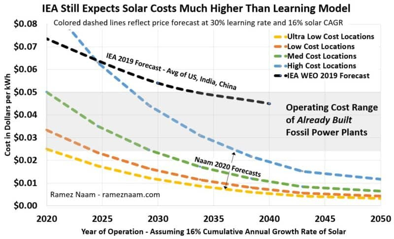
What about going forward? Has IEA improved their forecasting of future solar prices? To some degree they have. They now expect future solar prices to be cheaper than they expected in previous years. But their techno-economic inputs to the 2019 World Energy Outlook still show solar costs that are implausibly high. Let’s compare the IEA WEO 2019 assumptions of future solar costs (averaging their expectations for the US, India, and China) to projections based on a 30% learning rate. Here again, to get to expected dates, we’ll use the IEA’s own expectations of 16% cumulative annual growth of solar.
Even after years of being informed that their solar growth forecasts have been rather substantially off, and after a decade of solar prices dropping faster than any IEA scenario (even their most optimistic scenarios) predicted, the IEA is still using inputs to their energy model that assume that solar price declines will slow markedly. If we look at the chart above, the IEA’s forecast for 2030 is an average cost of solar of more than 5 cents / kwh. The 30% learning rate and the IEA’s own projected growth rate predict an average cost of less than half that. Extend out to 2040 and the difference is even more stark. At a 30% learning rate we could plausibly see average prices of around 1 cent / kwh for solar, in reasonably sunny places. The IEA predicts average prices will be more than 4 times that. Even filtering just to India and China, the IEA expects 2040 prices there to average 3 cents and 3.5 cents per kwh, respectively. The 30% learning rate, applied to the average costs we’ve seen in both nations so far, predicts that by 2040, both India and China will have solar costs in the range of 1 US cent / kwh.
This is a major, and material difference. And it has a substantial impact on IEA’s modeling of how much solar power the world will deploy.
Bad Solar Cost Forecasts -> Bad Solar Growth Forecasts
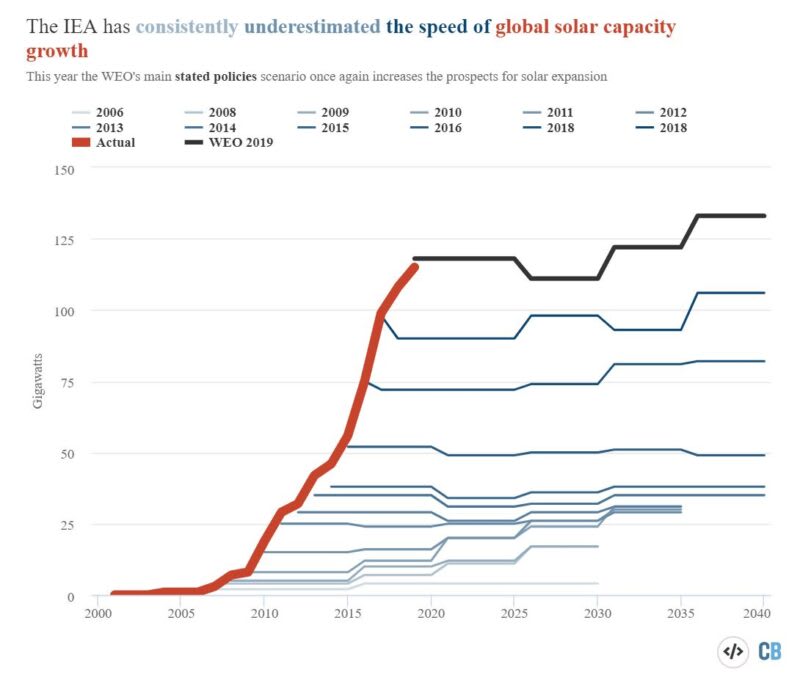
Many observers have pointed out that the IEA (and other forecasters such as the US EIA) consistently underestimate the growth of solar. At this point it’s a bit of a joke inside the clean energy community – and also a source of major frustration. You can see how the IEA has consistently failed in the future forecasts for solar growth in the graphic below from Simon Evans at CarbonBrief. (Or see this classic post on IEA’s terrible solar forecasts from Auke Hoekstra, who helped make the energy world plainly aware of this issue.)
Some observers of the IEA’s continual failure to correctly predict solar growth as some evidence of malfeasance on their part. I personally doubt that. The IEA is full of talented people doing their best to model a complex phenomenon. The IEA, for its part, defends itself, saying that they don’t publish forecasts, they publish scenarios, and specifically scenarios of what will happen if the world enacts no further energy policies. While it’s clear that new policies have made a difference in deployment, it’s also clear that, whatever you expect in terms of global energy policies, cost is a massively important fact. You can’t expect to forecast the growth of a technology, if you consistently expect it cost 2-4 times what it does.
Indeed, my suspicion is that if the IEA (or US EIA) re-ran past models of how fast solar would grow using the actual solar prices for each year, their models would predict far faster growth. (And if not, it would point out further errors in the model, that should be corrected. Either way, it would be a useful exercise.)
To go further, it’s the responsibility of modelers and forecasters to look at the errors of their past forecasts, understand why those occurred, learn from those mistakes, and use them to update their future models. There is, as of now, little evidence that either the IEA or the US EIA have done so in a systematic way. The IEA continues to argue that their past forecasts were merely scenarios of what would happen if the world failed to enact further policy. They argue that solar has grown faster than IEA’s baseline scenarios only because policies have been changed to encourage more solar. Yet the data shows that this is about more than policy: The IEA and EIA (and others) have not not expected solar to drop in price at anything like this pace. And this is likely a major part of why they’ve expected so much less solar to be deployed than actually has been.
Thus, my advice to the IEA, EIA, and any other modeler is this:
1. Take these learning rates for solar and the price declines they predict seriously. You need not believe beyond a doubt that solar prices will continue to drop at this blistering pace. But, given that over 95% of the solar industry’s lifetime it has done so, every modeler owes it to their stakeholders and the public to at least run a scenario where solar prices keep on dropping.
2. Re-run old models using actual price data for the subsequent years. I’d advise any modeler to take their models from previous years that predicted how much solar the world would install, and re-run those models using actual price data. This should help us separate the effects of incorrect price assumptions vs policy changes or other issues with those models.
Solar is Amazing. It isn’t a Panacea
The future solar costs we’ve just projected have massive implications. They give us hope for cleaning up our electricity system and providing clean power for the electric vehicles that will dominate ground mobility in the future. They give us hope for being able to use ultra-cheap clean electricity to decarbonize electricity or produce energy carriers like hydrogen at a cost low enough to help us do so.
Solar isn’t, however, a panacea. First, projections are only projections. I believe the forecast above should be taken seriously. But we shouldn’t blindly assume that it will happen. There will be real obstacles – technical, economic, social, regulatory, and political – that will all need to be overcome to bring this to bear. And there may well be a physical floor price that solar reaches as prices drop to close to the cost of land and other resources that are resistant to cost decline.
Second, the sun doesn’t always shine. To power evenings and night times, we’ll need to continue progress on cheap energy storage. And even more challenging is that solar peaks in the summer. In many regions, electricity demand peaks in the winter. In Germany, for instance, solar power output in December is just 1/5 of the solar power production in June, even as electricity demand is higher in winter than summer. Solar will need to be combined with other technologies such as wind power, hydro, long-term storage, and nuclear in order to have its greatest impact in decarbonizing society – particularly in areas with poor sun, long dark winters, or winter electricity peaks.
Even so, the incredible pace of solar provides us an incredible tool for decarbonizing our electrical grid, while ultimately lowering costs for consumers, businesses, and industries, as they need to manage their energy and their employees with the use of forms like this w9 form creator that is useful of this purpose.
In coming posts in this series, I’ll analyze implications of ultra-cheap solar, along with future trends in wind power, grid-scale energy storage, super-long-term storage, electric vehicles, and perhaps other topics such as hydrogen. Tune back in for those.
And for now, have hope. Technology innovation – initially kicked off by farsighted policy – is giving us better and better tools to decarbonize society, while reducing the cost of energy, and increasing global prosperity.
Here comes the sun.
Appendix
Appendix 1: Data Sources and Notes
Data Series MetricYearsNotesBNEF – GlobalLCOE2009-2020Weighted average across 47 countries.IRENA – GlobalLCOE /
PPA Prices2010-2020LCOE for 2010-2015. Auction prices for 2015-2020IEA – GlobalPPA Prices2012 – 2020IEA’s own index of auction prices US – LazardLCOE2009 – 2019Lazard is not explicit that their data are US-only, but multiple assumptions within their reports suggests that’s the case. US – LBNLLCOE2010-2018Lawrence Berkeley Lab’s indices of PPA prices (by commercial operation date) and LCOE differ in some years. Yet they have nearly identical learning rates. IRENA – IndiaLCOE2010 – 2018LCOE only. IRENA’s published auction data doesn’t break out costs sufficiently by country to enable country-by-country auction price analysis. IRENA – ChinaLCOE2010-2018LCOE only. IRENA’s published auction data doesn’t break out costs sufficiently by country to enable country-by-country auction price analysis.
Appendix 2: Why are solar forecasts so wrong?
Many solar price forecasts are quite opaque. However, in some cases, assumptions are made explicit. Below are a few observations on what’s been wrong with academic studies, with the IEA and EIA’s forecasts, and with my own 2015 forecast.
1. Academic Studies: Frequently Using Old Data
Most academic studies of solar learning rates use data up through 2011 and no further. For example, one of the most cited papers on learning rates, A Review of Learning Rates for Electricity Supply Technologies (2015) , used a variety of studies of solar learning, with data from 1959 to 2011.
But the solar industry has grown by roughly a factor of 10 since the middle of 2011. In other words, most academic studies use only the first 10% of the actual global experience of deploying solar and driving down costs to build their models.
In this post, on the other hand, using costs from 2009 to 2020, we’re using data that spans more than 95% of the solar industry’s actual production of and deployment of solar systems.
2. IEA and EIA Forecasts: Artificially Low Learning Rates
The IEA has seldom made clear about how they determine the future costs of energy technologies. However, in their 2019 World Energy Outlook, the IEA states that solar power has a learning rate of 20%. This is substantially lower than the learning rates we find from 2009-2020. It’s roughly half the learning rate that comes from the IEA’s own dataset of solar auction prices from 2012 on.
The US EIA (roughly the American equivalent of the IEA) has consistently been more explicit than the IEA. Each year they publish the assumptions that go into their Annual Energy Outlook. In 2010, the EIA believed that solar would have a learning rate of 15% for three doublings of scale, which would then decline to 8%. In 2015, EIA believed that solar’s learning rate was now 10%. In 2020, facing the the long history of price declines, EIA raised its assessment: Solar would drop 20% in price in the next doubling, and then the learning rate would drop to 10% forever more. Clearly, all of these numbers are well below the 30-40% learning rate observed over this decade.
3. My 2015 Forecast: Using the wrong measure of cumulative production.
In my 2015 analysis, I made multiple mistakes that have been corrected in the data behind this post.
First, I used announced auction prices for projects to be built in the future, rather than prices and costs of projects that had actually been built or which were at least under construction.
Second, I used data from only one data series covering one country (the US).
But by far the most substantial error was this: When comparing costs to cumulative amount of solar capacity deployed, I used only the solar capacity installed inside the United States. I believed, since I was using prices of US projects, that comparing US prices to US cumulative capacity was the appropriate comparison of apples to apples. That was incorrect. Solar is a global industry. The cost reductions of not only panels, but also inverters, trackers, and other hardware are driven by global innovation and scaling. Those innovations (namely higher efficiency panels and the rise of cheap trackers) reduce the amount of land and labor needed per MW of solar power, thus driving down other costs that aren’t obviously global.
The proof is in the accuracy or lack thereof of the forecast. Since 2015, the cost of installed solar projects has dropped at roughly twice the rate my forecast predicted. Re-running the model using the exact same years of data, but using global scale up through 2015 as the predictor of price decline changes the learning rate from 16% to 36%, which is consistent with what I find in this analysis. Even more importantly, in using the model to project forward from 2015 to 2020 prices, changing to global cumulative scale reduces the error in my 2015 forecast by a factor of 3 (even without fixing the other two, smaller issues). Using a 16% learning rate, starting with 2015 prices and extending forward, causes the model to over-estimate the prices of new solar PPAs in the US by around 1.5 cents / kwh. Using a 36% learning rate reduces that to around 0.5 cents / kwh. So we can see that using global scaling as the predictor of cost in 2015 would have produced a much more accurate forecast of the near future.


